Shop
DreamUp AI Art
DreamUp
Join
Log In
User Menu
Upgrade to Core
Theme
Display Mature Content
Suppress AI Content
Get Help and Send Feedback
Terms of Service
Privacy Policy
Submit
Deviation
Submit your art
Upload your creations for people to see, favourite, and share.
DreamUp
Turn your dreams into reality
Generate your own AI work.
Status Update
Post an update
Tell the community what’s on your mind.
Journal
Post a journal
Share your thoughts, experiences, and stories behind the art.
Literature
Submit your writing
Upload stories, poems, character descriptions & more.
Subscription
Get your fans' support
Fund your creativity by creating subscription tiers.
komozeck on DeviantArt
https://www.deviantart.com/komozeck/art/alien-poster-sketch-1-182897121
komozeck
Deviation Actions
Add to Favourites
Comment
3
Favourites
Xenomorph On The Savane
jul19888
$2
160
Buy Exclusive
More by
komozeck
Watch
komozeck on DeviantArt
https://www.deviantart.com/komozeck/art/Alien-poster-3-184959284
komozeck
komozeck on DeviantArt
https://www.deviantart.com/komozeck/art/enough-107499913
komozeck
komozeck on DeviantArt
https://www.deviantart.com/komozeck/art/old-creature-sketch-214430107
komozeck
komozeck on DeviantArt
https://www.deviantart.com/komozeck/art/kertenkelle-138051547
komozeck
komozeck on DeviantArt
https://www.deviantart.com/komozeck/art/trex-107498547
komozeck
komozeck on DeviantArt
https://www.deviantart.com/komozeck/art/i-cant-look-at-the-last-slice-126870588
komozeck
komozeck on DeviantArt
https://www.deviantart.com/komozeck/art/19-Rattata-485941719
komozeck
komozeck on DeviantArt
https://www.deviantart.com/komozeck/art/nonsense-348669289
komozeck
komozeck on DeviantArt
https://www.deviantart.com/komozeck/art/sulu-sepken-144234107
komozeck
Suggested Deviants
artoflunatik
Watch
artoflunatik on DeviantArt
https://www.deviantart.com/artoflunatik/art/Alien-1979-poster-637007206
artoflunatik
artoflunatik on DeviantArt
https://www.deviantart.com/artoflunatik/art/Alien-424481937
artoflunatik
artoflunatik on DeviantArt
https://www.deviantart.com/artoflunatik/art/Alien-3-drawing-427852862
artoflunatik
jul19888
Watch
jul19888 on DeviantArt
jul19888 on DeviantArt
jul19888 on DeviantArt
MADARTISTJOC
Watch
MADARTISTJOC on DeviantArt
https://www.deviantart.com/madartistjoc/art/alien-360360371
MADARTISTJOC
MADARTISTJOC on DeviantArt
https://www.deviantart.com/madartistjoc/art/Alien-360764922
MADARTISTJOC
MADARTISTJOC on DeviantArt
https://www.deviantart.com/madartistjoc/art/Ma39-361150606
MADARTISTJOC
Suggested Collections
Alien
Hodges-Art on DeviantArt
https://www.deviantart.com/hodges-art/art/Xenomorph-305764651
Hodges-Art
Balaskas on DeviantArt
https://www.deviantart.com/balaskas/art/Alien-Film-Tribute-510578876
Balaskas
ivewhiz on DeviantArt
https://www.deviantart.com/ivewhiz/art/Xenomorph-Roster-Aqua-Alien-411847612
ivewhiz
Xenomorphs or Something
Mr--Jack on DeviantArt
https://www.deviantart.com/mr--jack/art/My-Little-Xenomorph-607368394
Mr--Jack
Chokorroll on DeviantArt
https://www.deviantart.com/chokorroll/art/Alien-Colors-613834824
Chokorroll
8BitRaven on DeviantArt
https://www.deviantart.com/8bitraven/art/Alien-Poster-607050526
8BitRaven
Alien and Predator
PatrickBrown on DeviantArt
https://www.deviantart.com/patrickbrown/art/Aliens-526192486
PatrickBrown
Jin-Saotome on DeviantArt
https://www.deviantart.com/jin-saotome/art/Custom-SNES-Snake-Alien-action-figure-404915779
Jin-Saotome
Rodrigo-Vega on DeviantArt
https://www.deviantart.com/rodrigo-vega/art/Internecivus-Raptus-Family-199102403
Rodrigo-Vega
You Might Like…
DeCiccio360 on DeviantArt
https://www.deviantart.com/deciccio360/art/Xenomorph-in-the-Darkness-507243509
DeCiccio360
calfCut on DeviantArt
https://www.deviantart.com/calfcut/art/breed-354483575
calfCut
YelZamor on DeviantArt
https://www.deviantart.com/yelzamor/art/ALIEN-Derelict-Ship-682077416
YelZamor
oiluig on DeviantArt
https://www.deviantart.com/oiluig/art/Alien-Isolation-WIP1-856971887
oiluig
muzski on DeviantArt
https://www.deviantart.com/muzski/art/Alien-colour-177759849
muzski
ChrisMonvel on DeviantArt
http://creativecommons.org/licenses/by-nc-nd/3.0/
https://www.deviantart.com/chrismonvel/art/Alien-800751033
ChrisMonvel
oktober-nite on DeviantArt
https://www.deviantart.com/oktober-nite/art/alien-74633861
oktober-nite
MissRana62 on DeviantArt
https://www.deviantart.com/missrana62/art/First-Born-Finished-468622791
MissRana62
P4T0FN4 on DeviantArt
https://www.deviantart.com/p4t0fn4/art/Predator-176648530
P4T0FN4
Featured in Groups
See All
Creaturecreators
PosterDesign
To-Be-Unknown
Grup-TurkArt
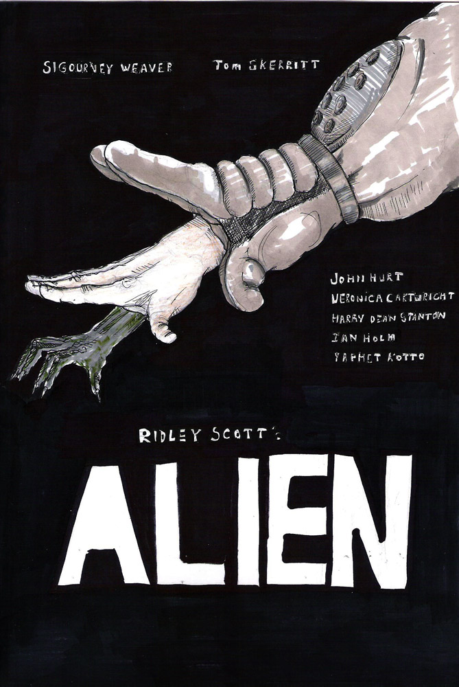
alien poster sketch 1
By
komozeck
Watch
Published:
Oct 16, 2010
45
Favourites
23
Comments
3.2K
Views
Description
1/10
Image size
669x1000px 179.21 KB
© 2010 - 2024
komozeck
Comments
23
Join the community
to add your comment. Already a deviant?
Log In
brokoloid
May 11, 2014
liking it!
Reply
Load more